Colors
The Cornell University brand has color standards for print and web. Each color standard has two sets of colors: primary and secondary.
Accessibility Requirements
When designing for the web, all web content must conform to the accessibility standards set by the university in
Policy 5.12: Web Accessibility
Standards.
Based on Web Content Accessibility Guidelines (WCAG 2.0), the criteria
for level AA conformance requires a contrast ratio of at least 4.5:1 for normal text and 3:1 for large text, greater
than 24 pixels or 19 pixels and bold. The chart below provides approved brand color combinations that meet WCAG 2.0
level AA standards.
Our Color Palette
Cornell’s primary brand color is red. Along with our logo, it is an immediate signal that any communication is
from the university. Different platforms allow for different applications of red — for example, a website vs
a
shirt — so we follow the “first and only” rule when applying Cornell red.
- In platforms like websites or brochures that allow for multiple colors, Cornell red should be the
first color
people see.
- For media that are limited in color, Cornell red should be the only color people see.
Following this simple rule will help you maintain a strong brand connection to the university and create coherent
and impactful materials.
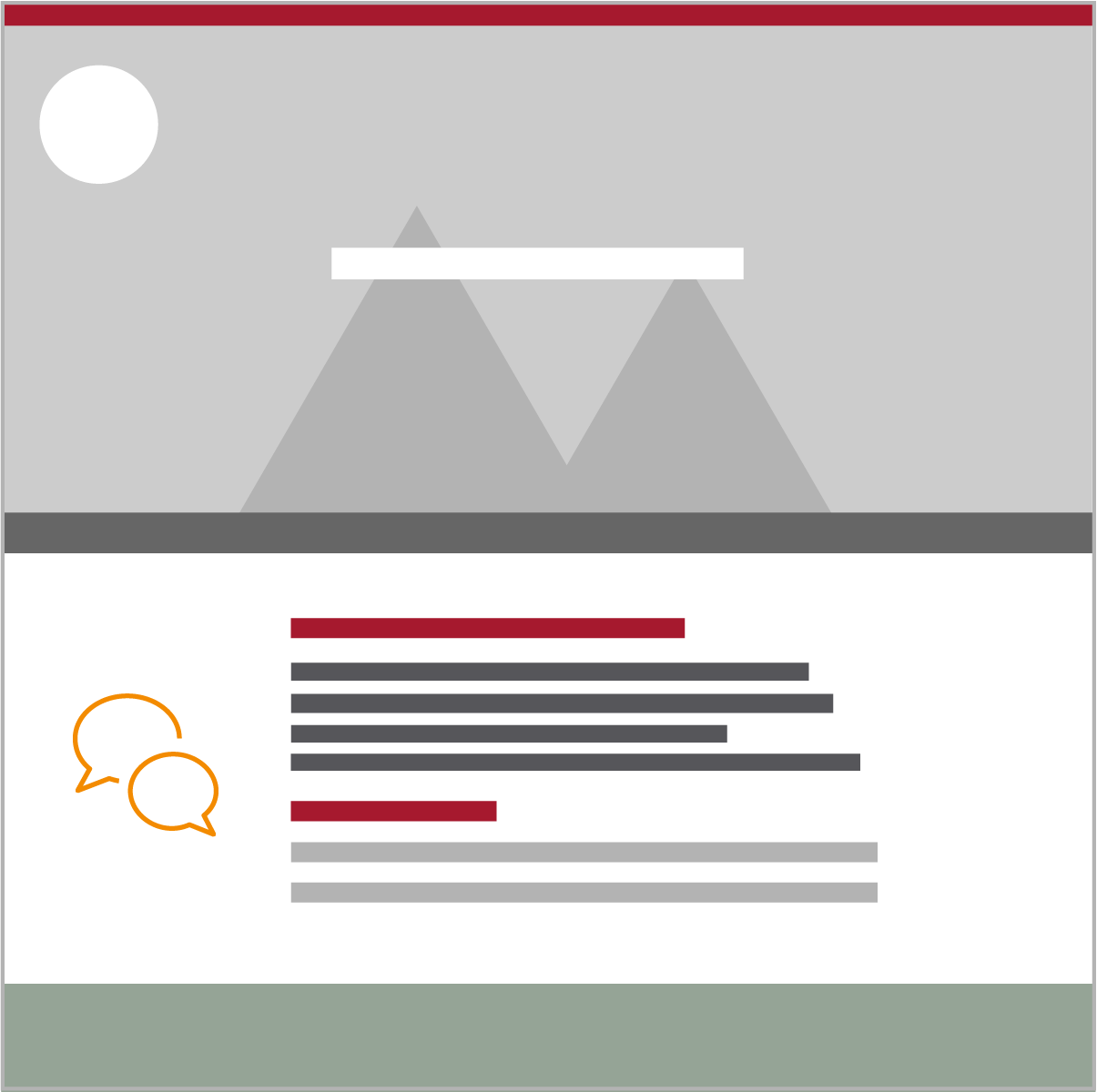
In addition to Cornell red, there are a number of other colors available to you. The graphic here depicts general
guidance for the use of color. While not an exact equation, the percentages should be referenced when working on
design.
Examples are provided below as a reference
for web layouts.
Primary Palette
Used for ~90% of your design or layout.
Primary colors are the officially recognized color palette for the university. These colors are
critical to leverage the Cornell brand and provide clear university consistency. Logos may only be represented in
carnelian, black or white.
| Color |
Print |
Web (Hex) |
Web accessible combinations |
Example uses |
| Carnelian |
PMS 187
CMYK (0,100,79,20)
|
|
-
White (#FFFFFF)
-
Light gray (#F7F7F7)
|
- Cornell seal
- Banners and backgrounds
- Headlines
|
| Dark gray |
PMS COOL gray 11
CMYK (48,36,24,66)
|
|
-
White (#FFFFFF)
-
Light gray (#F7F7F7)
|
- Cornell seal
- Banners and backgrounds
- Headlines and body text
|
| White |
|
|
-
Carnelian (#B31B1B)
-
Dark gray (#222222)
|
- Cornell seal
- Banners and backgrounds
- Headlines or body text on dark backgrounds
|
Secondary Palette
Used for ~7% of your design or layout.
These neutral hues pair perfectly with the primary palette. Use these as supplementary colors rather than driving
colors in layout and communications.
| Color |
Print |
Web (Hex) |
Web accessible combinations |
Example uses |
| Light gray |
|
|
-
Carnelian (#B31B1B)
-
Dark gray (#222222)
|
- Backgrounds
- Secondary text on dark backgrounds
|
| Dark Warm gray |
PMS 403
CMYK (14,18,22,42)
|
|
|
|
| Sea gray |
PMS 5635
CMYK (29,8,25,24)
|
|
|
|
Accents
Used for ~3% of your design or layout.
Although our primary and secondary palettes should guide most layouts, in certain instances other colors may be
needed. For those circumstances, refer to the accent palette. These colors should not be used as full-color bleeds and
should be used periodically and in moderation.
Note: In no instance should accent colors become the primary color for a school, center, institute or
department.
| Color |
Print |
Web (Hex) |
Web accessible combinations |
Example uses |
| Blue / Link blue |
PMS PROCESS BLUE
CMYK (100,13,1,2)
|
|
-
White (#FFFFFF)
-
Light gray (#F7F7F7)
|
|
| Green |
|
#6EB43F
Graphic elements only
|
|
Highlights important features, but is used sparingly
- Visual style elements, such as line breaks or color blocks without text
- Small fill areas
|
|
|
-
White (#FFFFFF)
-
Light gray (#F7F7F7)
|
|
|
|
| Orange |
|
#F8981D
Graphic elements only
|
|
Highlights important features, but is used sparingly
- Visual style elements, such as line breaks or color blocks without text
- Small fill areas
|
|
|
-
White (#FFFFFF)
-
Light gray (#F7F7F7)
|
| Secondary Red |
PMS RED 032
CMYK (0,90,60,0)
|
#EF4035
Graphic elements only
|
|
Highlights important features, but is used sparingly
- Visual style elements, such as line breaks or color blocks without text
- Small fill areas
|
|
|
-
White (#FFFFFF)
-
Light gray (#F7F7F7)
|
| Navy |
PMS 7463
CMYK (100,62,12,62)
|
|
-
White (#FFFFFF)
-
Light gray (#F7F7F7)
|
|
Examples
These simplified web page layout examples show the ratio of primary, secondary and accent colors to each other.
For more information about using approved colors, please request a brand
consultation.